Dark Backgrounds for Dashboards ?
by Jerad Rutnam -
Why dark color backgounds?
Darker color scheme is oftenly used in softwares that focuses heavily on visual content. ( e.g Dashboards/Insights ).
For example Adobe Lightroom, Adobe After Effects and Microsoft Expression Blend are interfaces that have a dark color theme.
This allows the interface to fade into the background and let the content come alive.
Why is it not widely used?
Because it depends on the crowd/users. As this very subjective. For these applications, it tends
to work out great but many people don’t like dark interfaces. At my company I created an interface for a very complicated
piece of software using a dark UI. It helped to simplify everything and bring attention to the necessary elements at specific times.
The problem was, a lot of people complained. “It’s too dark,” “it doesn’t look good on my laptop when I am using in
the bright sun” etc. Some people just hate dark interfaces.
Bottom line: if your application is very content driven, esp with visual content, consider a dark interface
but be prepared for some opposition.
Alternative solution: Provide 2 themes, one Light and one Dark.
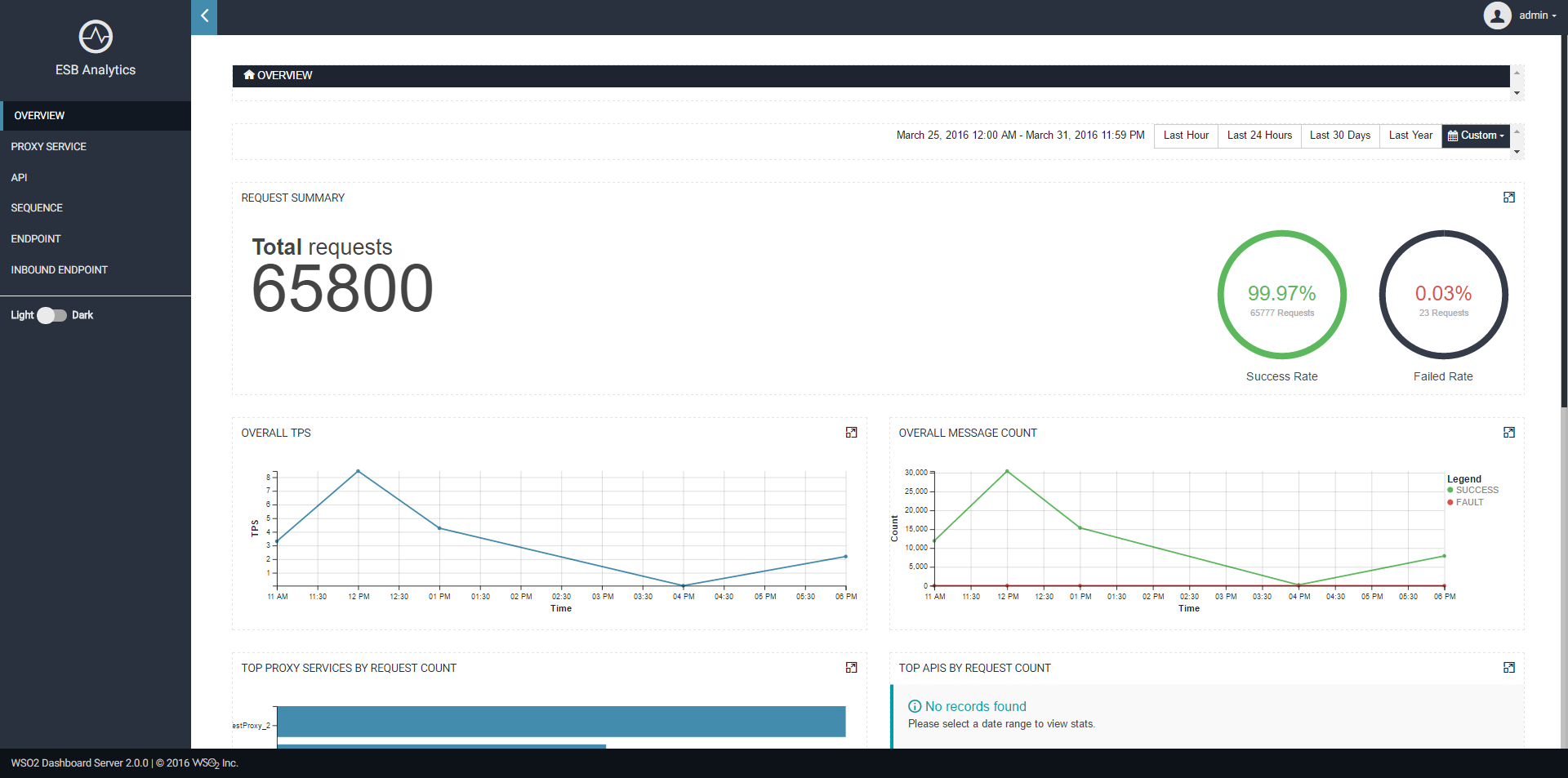
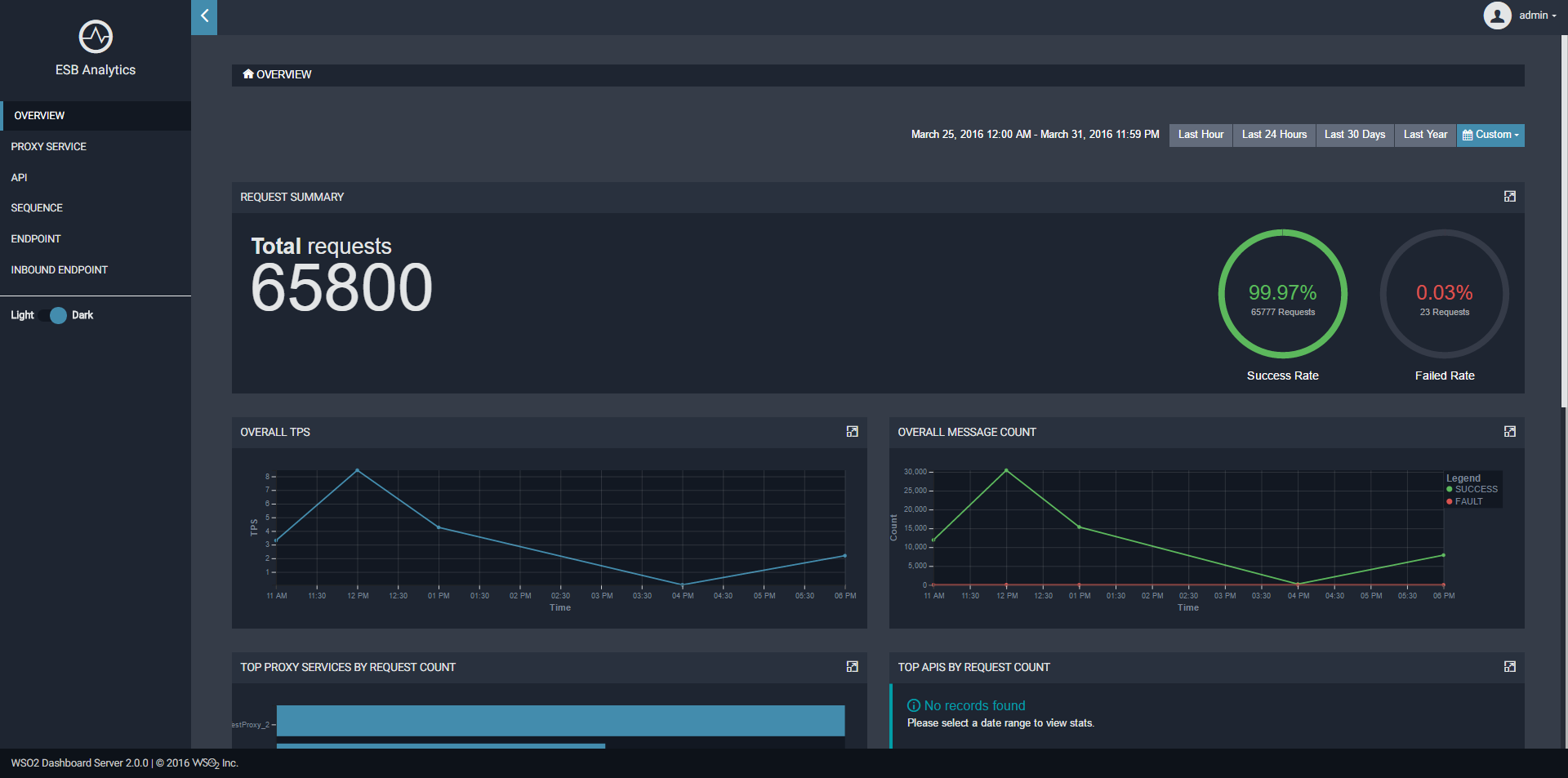
WSO2 ESB Analytics Server ( Powered by WSO2 Dasboard Server & Data Analytics Server )
Also, it is important to note that it is often a bit more difficult to get a dark interface that works well. A little more care must be given to legibility of text on the dark background ( e.g. making it bright enough to be legible but not so bright that it is distracting to read ).